Going for the Gold
In the spring of 2012, I had been reading about early- and mid-20th century painting, the Suprematism of Kazimir Malevich and the color studies of Josef Albers in particular.
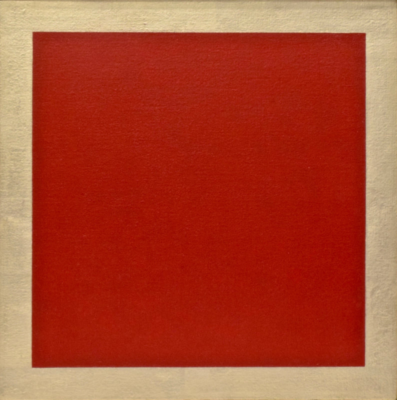
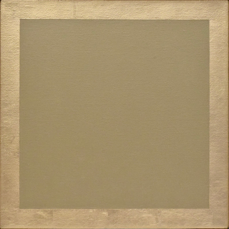
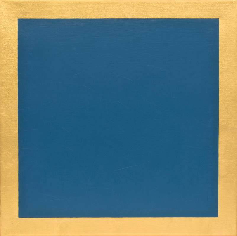
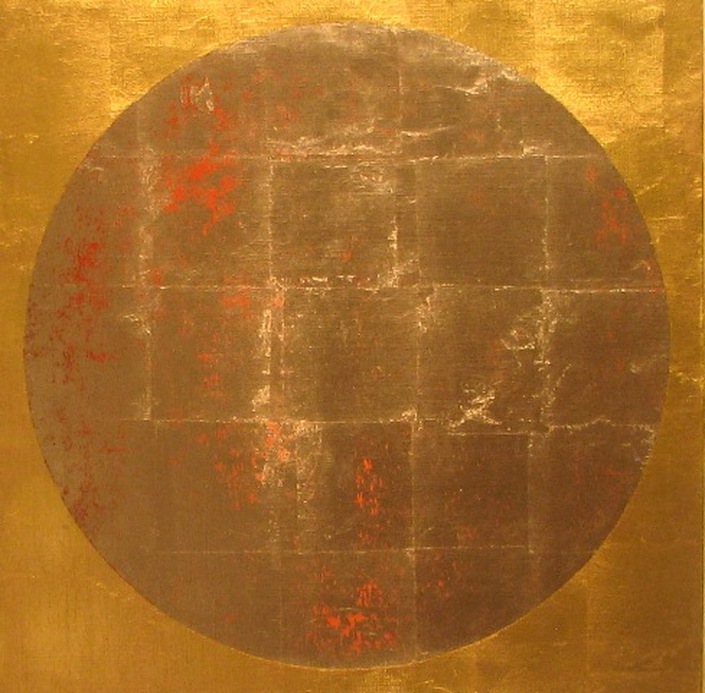
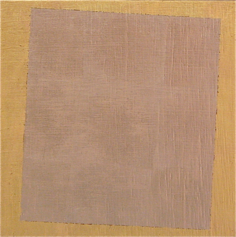
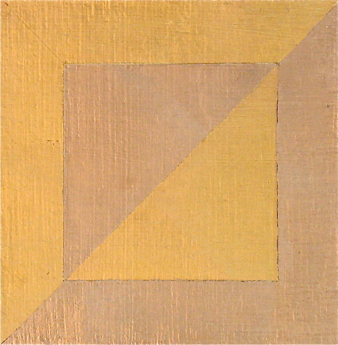
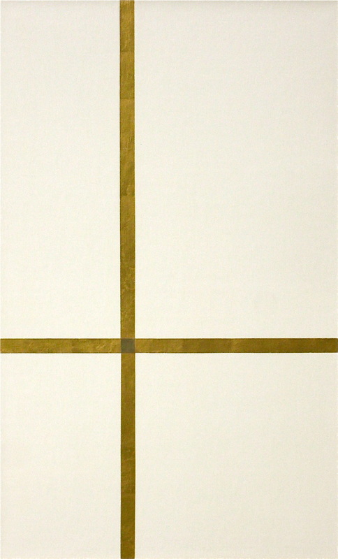
I have always loved the stark, bold, geometric simplicity of Malevich’s groundbreaking works (Black Square, Black Circle, White on White). To me they stand as icons of abstraction and modernism, and I thought those early works deserved to be reinterpreted in the tradition of gilded Russian icons. This resulted in Malevich on My Mind, Eternal, The Way It Is, Mother Lode, and After Malevich, all based loosely on his paintings from 1915 to 1918.
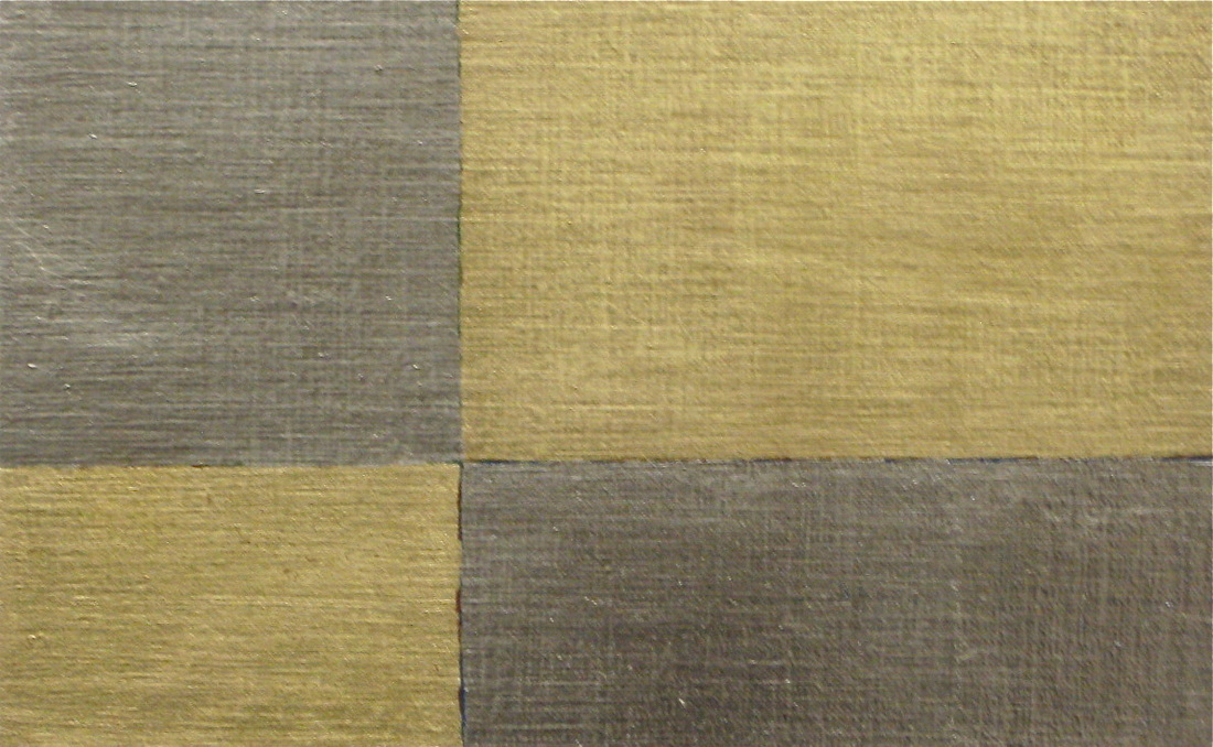
In 1950, while teaching at Yale University, Josef Albers began color studies that became his series Homage to the Square, a project he worked on for the rest of his life. This was a seemingly simple image that he derived from careful and exacting modifications, initially using cut-out shapes to determine the nested squares’ placement and proportional relationships. I thought this well-known image deserved its iconic status in gold (Homage to Josef Albers and Homage to Josef Albers, 2).
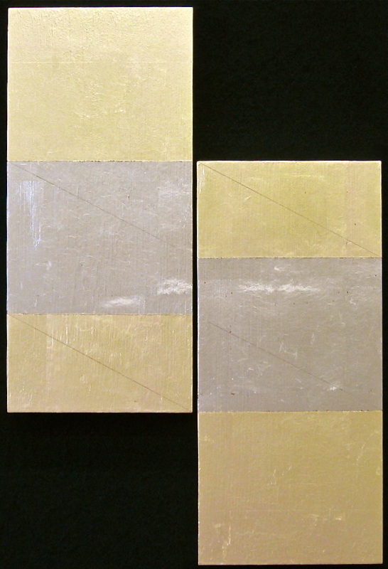
Gold Brick, According to the Golden Mean, and Golden Sections are three designs based on the golden ratio (1:1.618), a mathematical principle dating back possibly as far as the pyramids of ancient Egypt, and used by builders, designers, artists, and architects ever since to create a sense of balance and proportion pleasing to the eye.
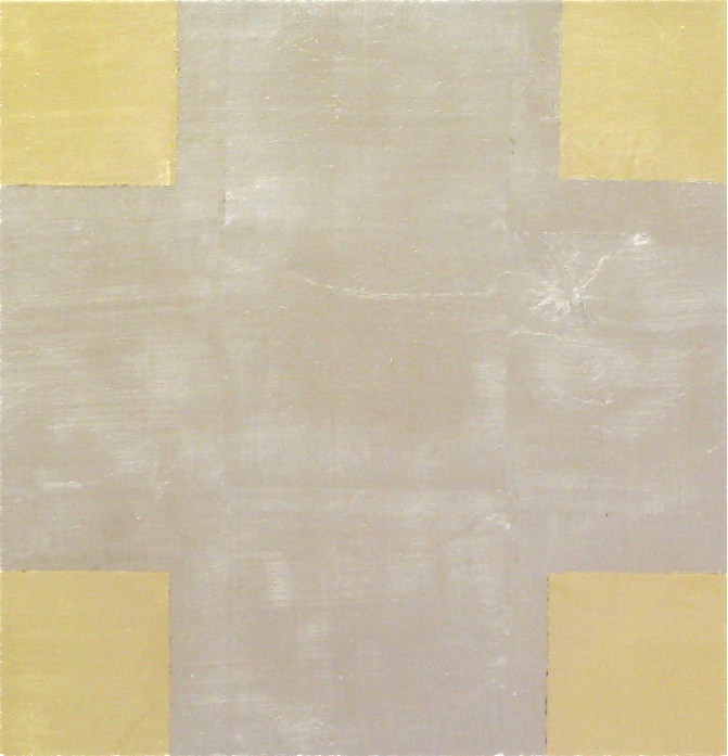
The theme of gold in our language is played out further with riffs on such clichés and expressions as Mother Lode, Gold Brick, and Bands of Gold.
The Coca-Cola and Chevy logos have reached the status of icons in our consumerist culture. Therefore, I allude to Russian icon painting again by using ikona, transliterated from the Cyrillic, as the title for the Coca-Cola piece, IKONA (Icon). With the Chevy piece, I took the liberty to reverse the colors of the corporate logo’s white and yellow gold to create a more august and stately presence and to surprise the viewer. (My husband, sculptor Charles Gibbs, built the shaped panel for me since my carpentry skills are limited to the simple white frames and cradled panels I build for my paintings.) I chose the name Iconic because it is just that.
Clearance pokes fun at the public’s persistent obsession with gold leaf frames: a banal generic landscape marked down for clearance. Stanhope Framers in Boston built the beautiful frame.
I have always loved the stark, bold, geometric simplicity of Malevich’s groundbreaking works (Black Square, Black Circle, White on White). To me they stand as icons of abstraction and modernism, and I thought those early works deserved to be reinterpreted in the tradition of gilded Russian icons. This resulted in Malevich on My Mind, Eternal, The Way It Is, Mother Lode, and After Malevich, all based loosely on his paintings from 1915 to 1918.
In 1950, while teaching at Yale University, Josef Albers began color studies that became his series Homage to the Square, a project he worked on for the rest of his life. This was a seemingly simple image that he derived from careful and exacting modifications, initially using cut-out shapes to determine the nested squares’ placement and proportional relationships. I thought this well-known image deserved its iconic status in gold (Homage to Josef Albers and Homage to Josef Albers, 2).
Gold Brick, According to the Golden Mean, and Golden Sections are three designs based on the golden ratio (1:1.618), a mathematical principle dating back possibly as far as the pyramids of ancient Egypt, and used by builders, designers, artists, and architects ever since to create a sense of balance and proportion pleasing to the eye.
The theme of gold in our language is played out further with riffs on such clichés and expressions as Mother Lode, Gold Brick, and Bands of Gold.
The Coca-Cola and Chevy logos have reached the status of icons in our consumerist culture. Therefore, I allude to Russian icon painting again by using ikona, transliterated from the Cyrillic, as the title for the Coca-Cola piece, IKONA (Icon). With the Chevy piece, I took the liberty to reverse the colors of the corporate logo’s white and yellow gold to create a more august and stately presence and to surprise the viewer. (My husband, sculptor Charles Gibbs, built the shaped panel for me since my carpentry skills are limited to the simple white frames and cradled panels I build for my paintings.) I chose the name Iconic because it is just that.
Clearance pokes fun at the public’s persistent obsession with gold leaf frames: a banal generic landscape marked down for clearance. Stanhope Framers in Boston built the beautiful frame.
"Urban Square (Harvard)" 2022 - oil/gold leaf/linen
14" x 14"
"Urban Square (Copley)" 2022 - oil/gold leaf/linen 14" x 14"
"Urban Square (Teele)" 2022 - oil/gold leaf/linen 14" x 14"
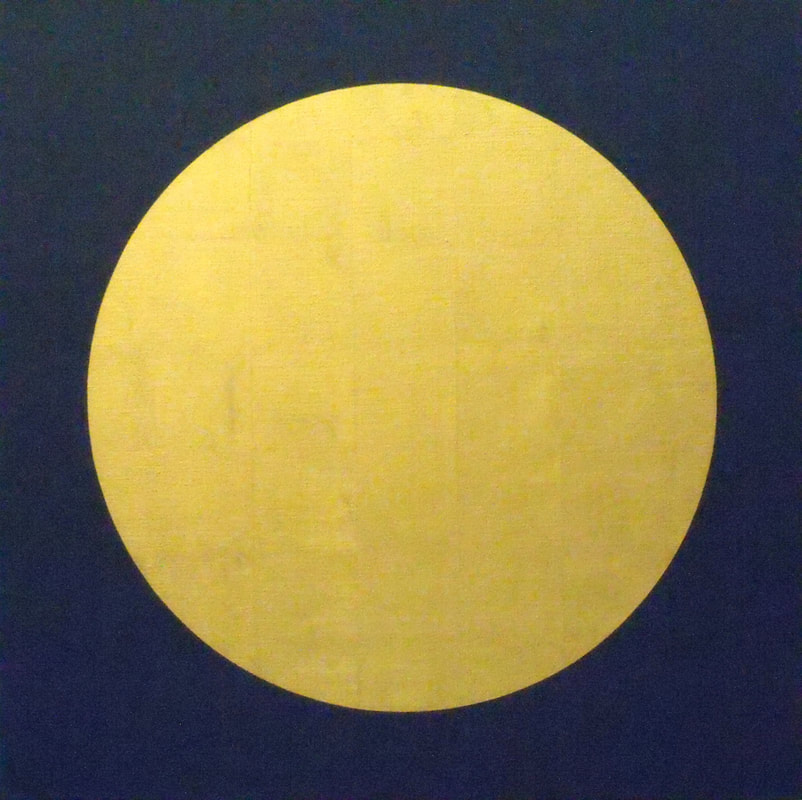
"Harvest Moon" 2018 - oil/23-K gold leaf/linen 26" x 26" Private Collection
"Charlie (Affirmative)" 2018 oil/23-K gold leaf/linen 20" x 24" - "Charlie" in the phonetic alphabet is the insignia (signal flag) that ships use to communicate to other ships. It means "affirmative," which is a nice and positive connotation. Private Collection
"Malevich on My Mind" 2012 - oil/23-K gold leaf/panel 7.875" x 7.875"
"Eternal - For Neil Armstrong" 2012 - oil/23-K gold leaf on panel 18" x 18"
"The Way It Is" 2012 - oil/23-K gold leaf/panel 9.875" x 9.875"
"Mother Lode" 2012 - oil/23-K gold leaf/panel 5.875" x 5.875"
"After Malevich" 2012 - oil/23-K gold leaf/panel 9" x 9" Private collection
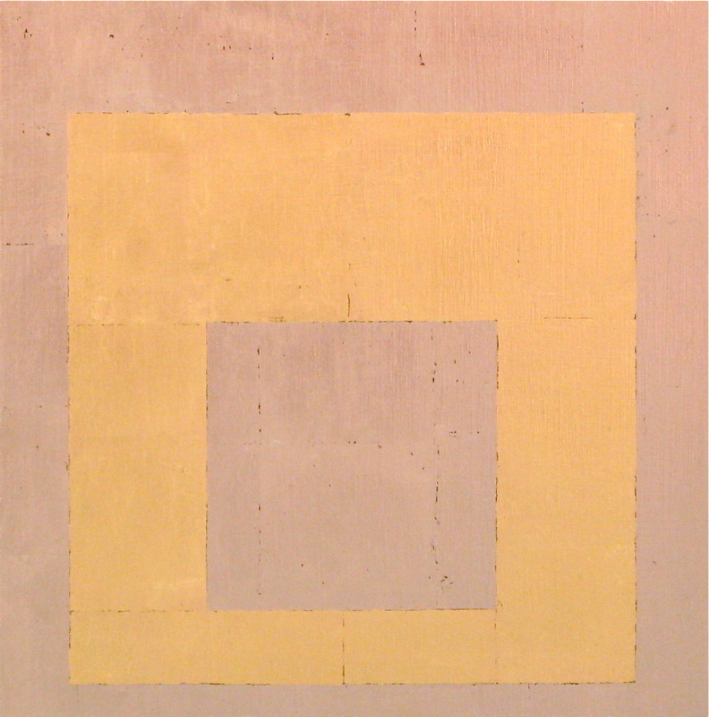
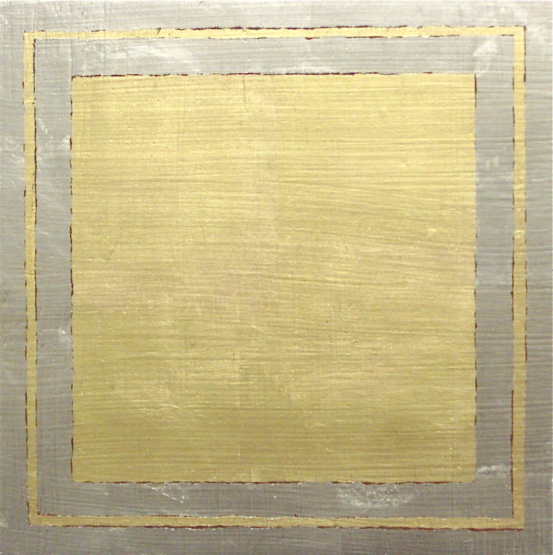
"Homage to Josef Albers" 2012 - oil/23-K gold leaf/panel 14" x 14" Private collection
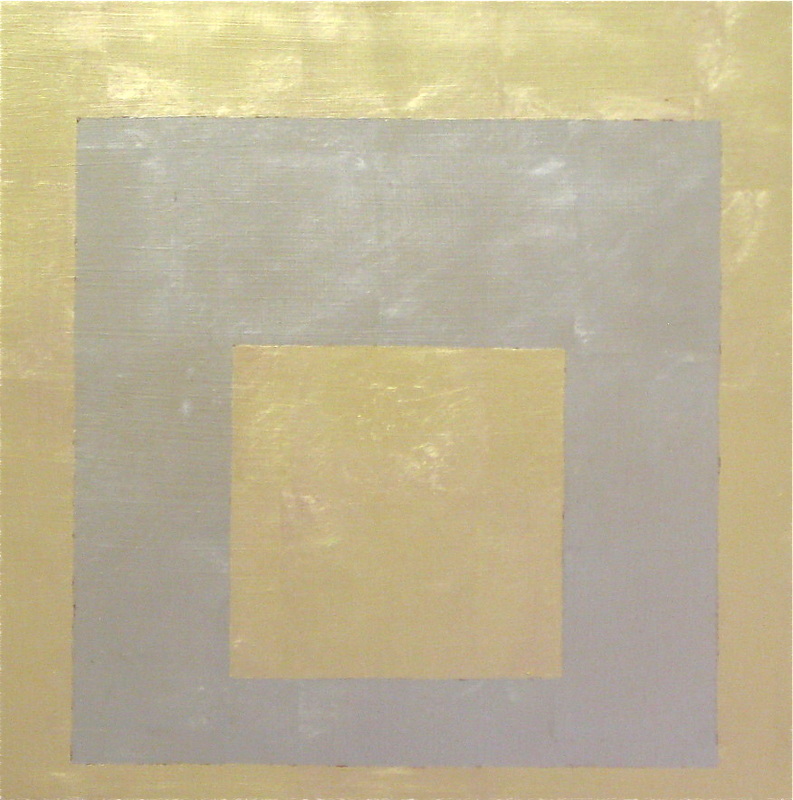
"Homage to Josef Albers, 2" 2012 - oil/23-K gold leaf/panel 14" x 14"
"Golden Sections" 2012 - latex/oil/3-K gold leaf/panel 38.625" x 23.875"
"According to the Golden Mean" 2012 - oil/23-K gold leaf/panel 5.125" x 8.125" Private collection
"Gold Brick" 2012 - oil/23-K gold leaf/panels 16.25" x 11"
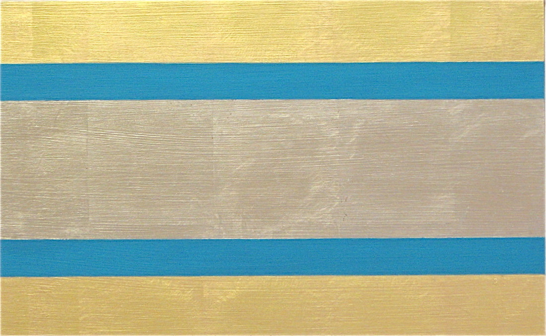
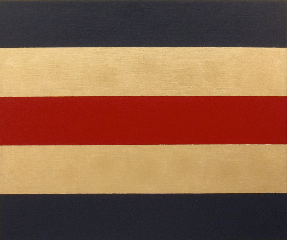
"Bands of Gold" 2012 - oil/23-K gold leaf/panel 9.0626" x 14.66"
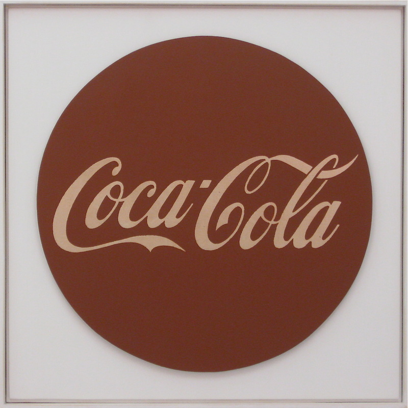
"IKONA (Icon)" 2012 - oil/23-K gold leaf/panel - 22" tondo mounted on 26" X 26" panel
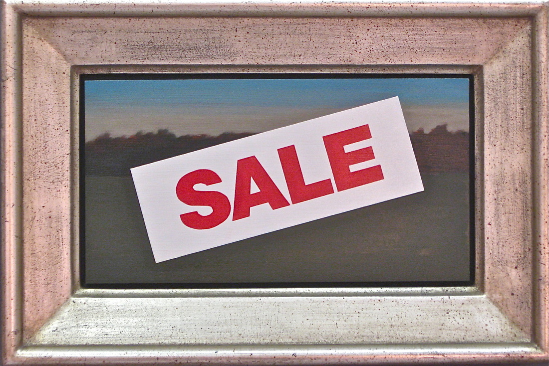
"Clearance" 2013 - oil/panel/gold leaf frame 5.3125" x 10.0625 (not including frame dimensions) Private Collection